

 AI-ready infrastructure
 Refer and earn

 Ethereum
 Hyperliquid
 Solana
 Arbitrum
 BNB Smart Chain
 Base
Base Polygon
 TRON
TRON Sui
Sui MegaETH


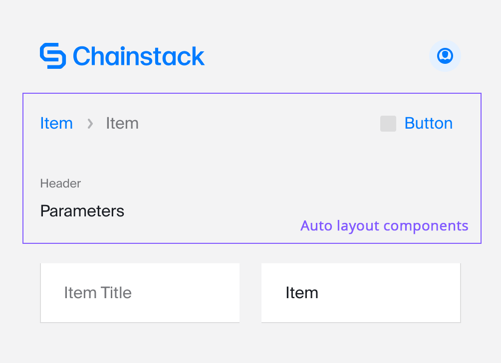
Auto Layout components in Figma
At Chainstack, we do pay attention to how people interact with our platform. That’s why we need to optimise the design processes that we have to be able to iterate faster and in a more efficient way. Here I will show how Auto Layout components help us to make it happen and how to create a full-page component using Auto Layout in Figma.
I’m a big fan of atomic design because it works well for designers, and it brings us closer to the approach that front-end developers use in their work. While we use the same approach, we can collaborate more effectively. With this in mind, I was trying to find a way to maximize the usage of the atomic design in my components library, and finally with the new Auto Layout it’s possible. Let’s take a look at what I’ve learned.
The approach
If you aren’t familiar with the atomic design concepts, I highly recommend you to read more about atomic design first.
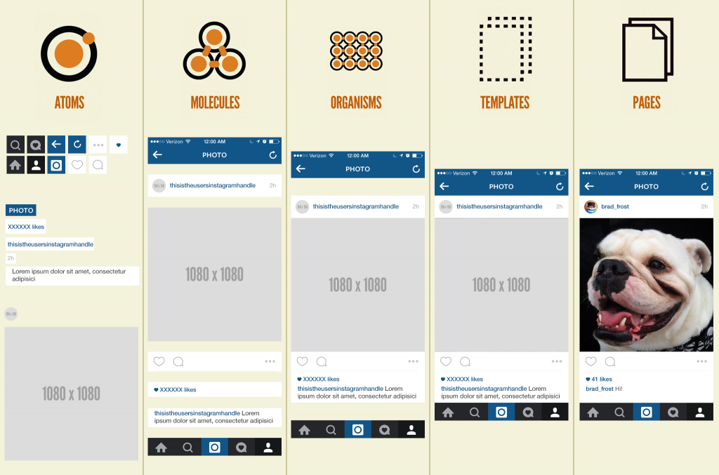
Source: https://atomicdesign.bradfrost.com/
The picture above illustrates the logic that I use for my components. With this approach, it’s easy to design components and—what’s very important—to support them after.
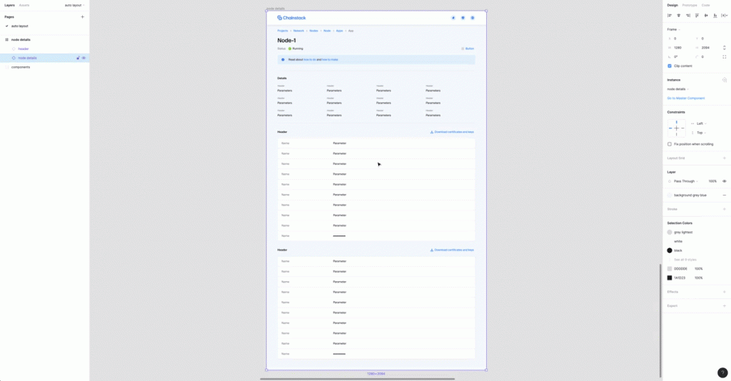
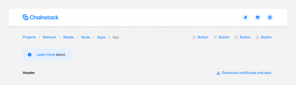
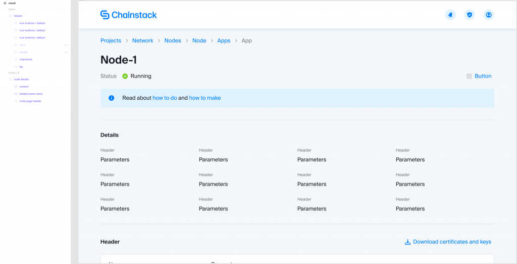
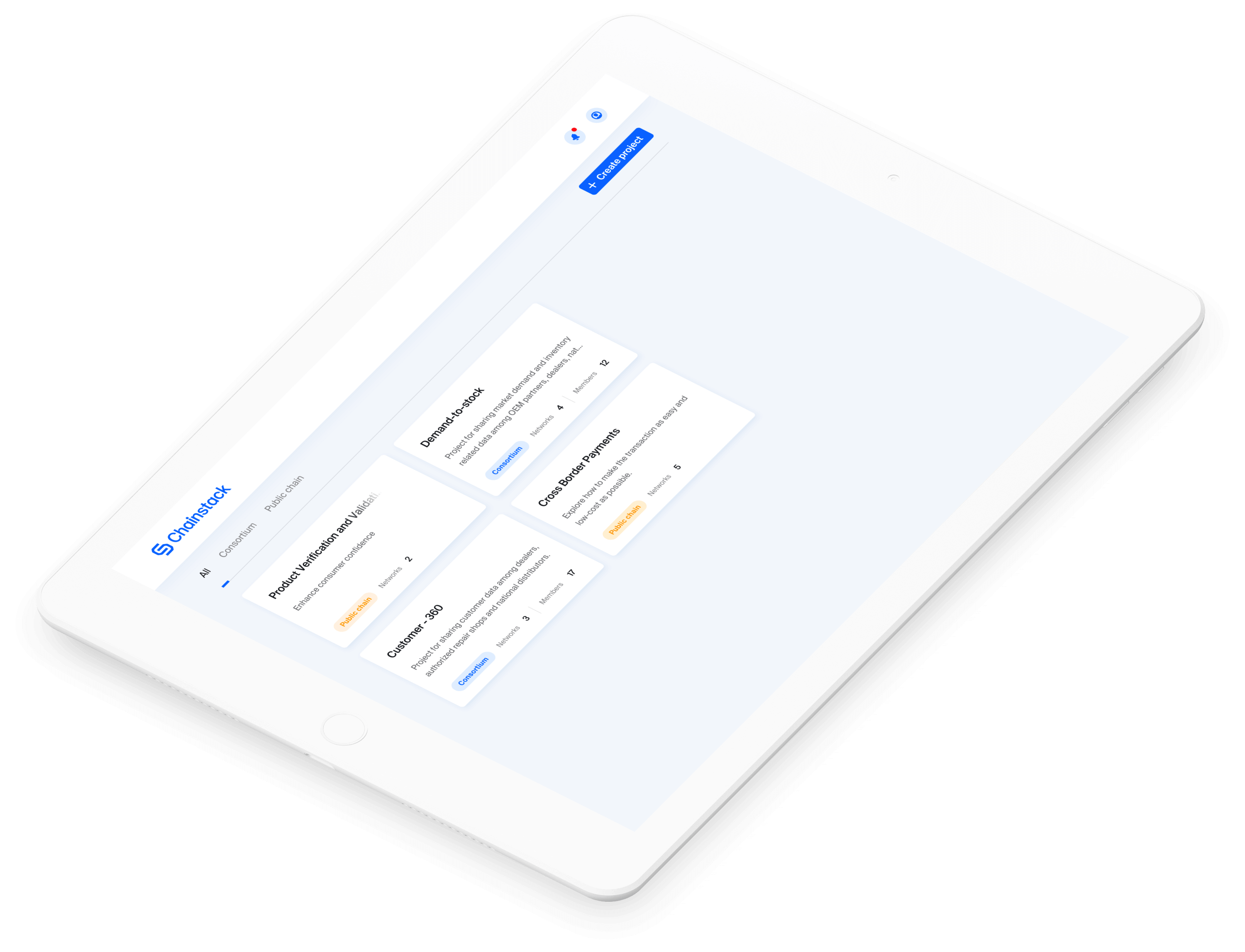
Below you can see the page I’ll use as an example. That’s a real page that I’ve designed and use in the project I’m working on at Chainstack. In this post, I’ll focus only on the components that use Auto Layout.
If you don’t want to dive into details, I put a link to the final result in Figma at the end of this post.
Atoms
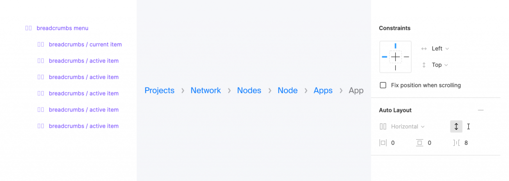
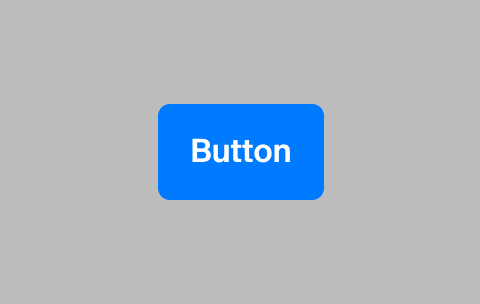
On the atomic level, everything is quite simple. I highlighted the components that use Auto Layout.
Let’s take a look at their anatomy. Text styles and colors are defined in Figma Styles.
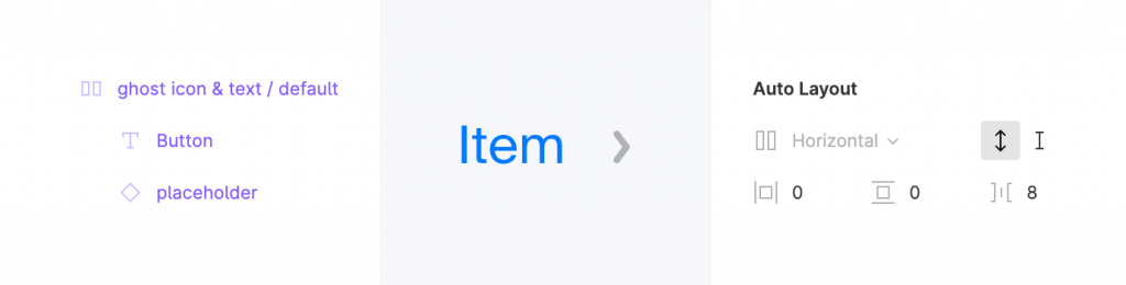
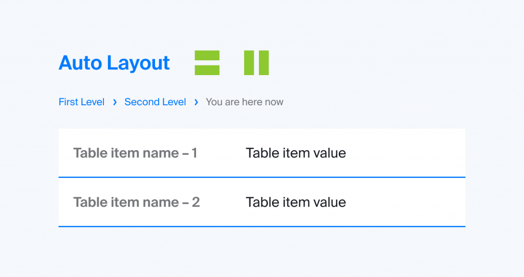
That’s a typical atomic level component. Auto Layout: Horizontal, Spacing Between Items 8px.
Molecules
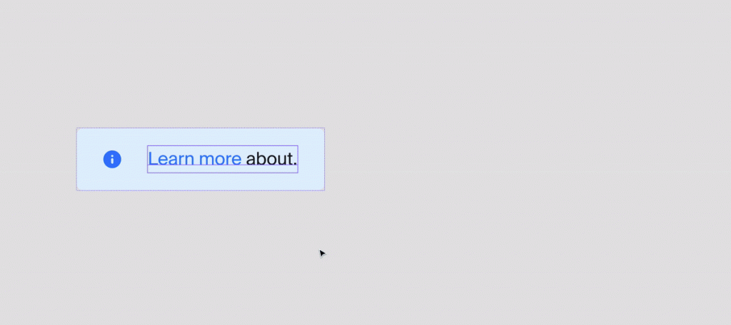
Here the things are getting a bit more challenging. For our molecules, we use only the atoms that we’ve created at the previous step and some of the base elements that I’ve created in my library (font & color styles).
The hint bar is the most challenging element here. I use it on a few different pages on the platform, and it behaves differently according to the situation. It should:
- Fit to the content size.
- Take the full width of the content area.
- Support multi-line text for both scenarios above.
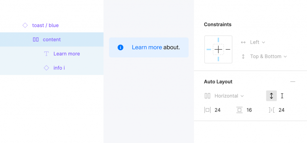
You can’t simply resize an Auto Layout component in Figma, but I don’t want to keep two very similar components in my library. I found a solution.
How it works:
I have an Auto Layout component that adjusts its size to the content, but it sits in a component without Auto Layout, so I can resize the parent component manually if I need to adjust it to the page width.
The rest of the components are quite simple.
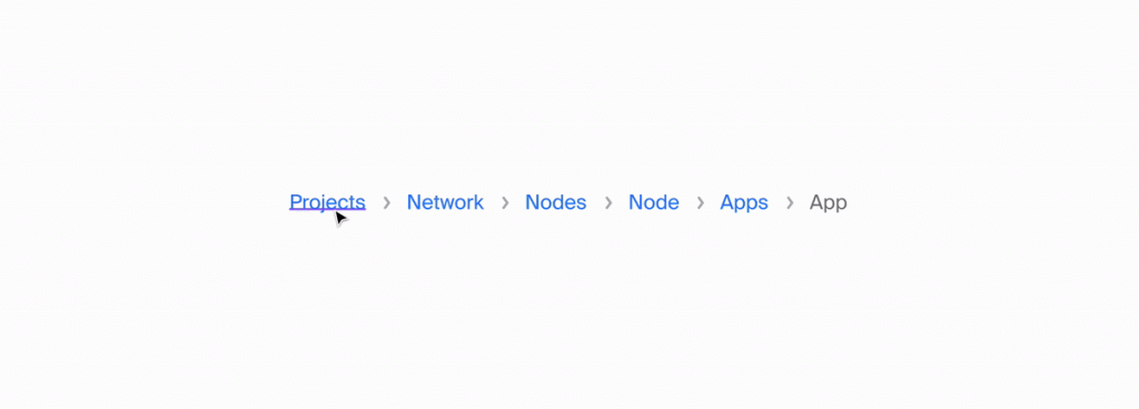
The breadcrumbs component, for example, is a stack of atomic components that behave in the same way as its children: atoms adjust their size to the content > the breadcrumbs component adjusts its size to the size of atoms inside.
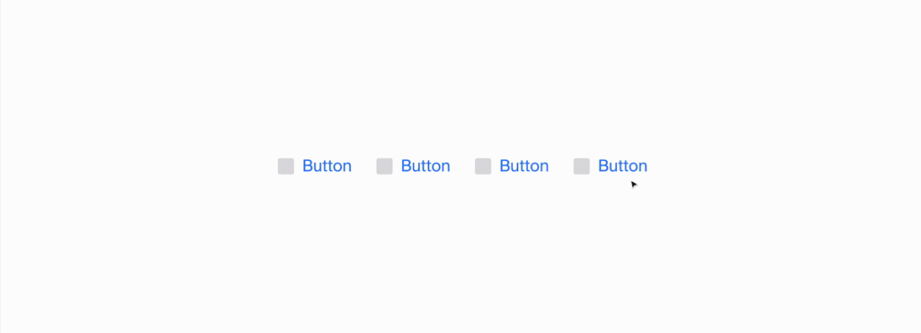
The buttons block works in the same way. It’s an Auto Layout component with a few atomic buttons components inside.
Organisms
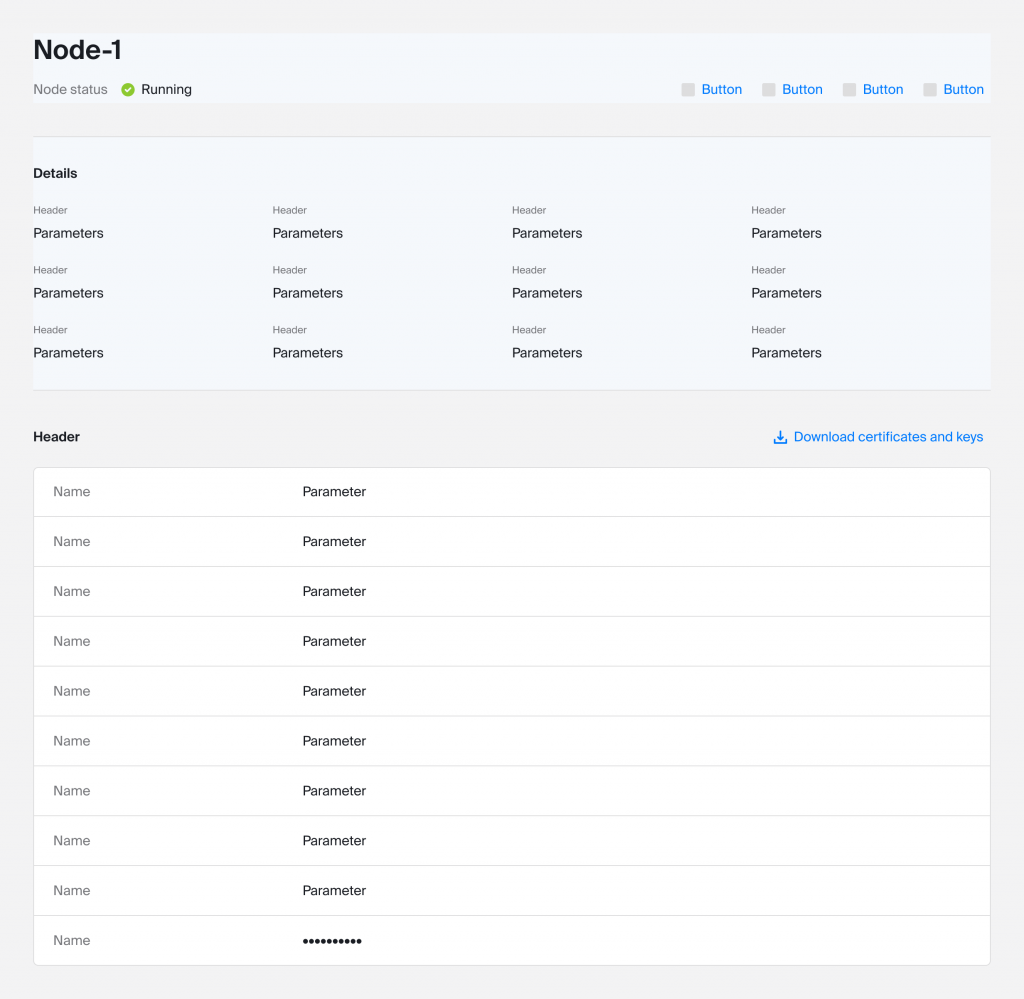
The most challenging part here was to organize the details section: it should support multi-line parameters. This means that all blocks should behave according to the amount of content the blocks above have. It can have from one to three rows of parameters, so we need to support any configurations within these limits:
- From 1 to 3 rows.
- Rows can have 4 blocks of information or less.
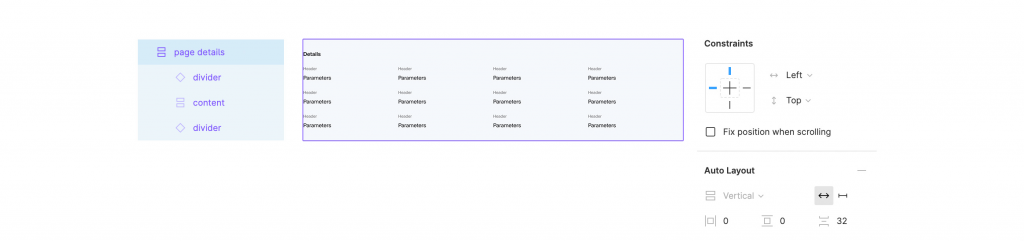
The first layer helps us create paddings around the content.
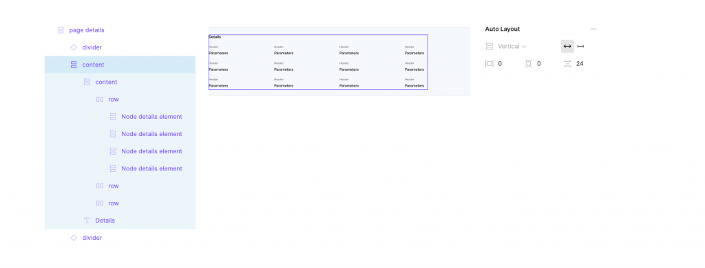
This layer split the content section from the section header (“Details”).
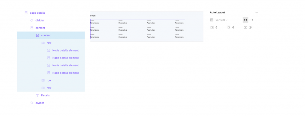
Here we create paddings between the rows with a few atomic design components inside.
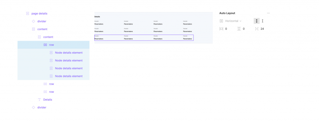
The final level is a row component with a few atomic design components inside. It behaves in the same way as the breadcrumbs component.
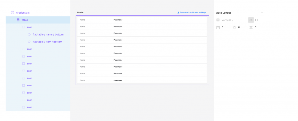
Another big organism is a table component, but it’s much simpler.
Here we need the first Auto Layout component to separate the header from the body.
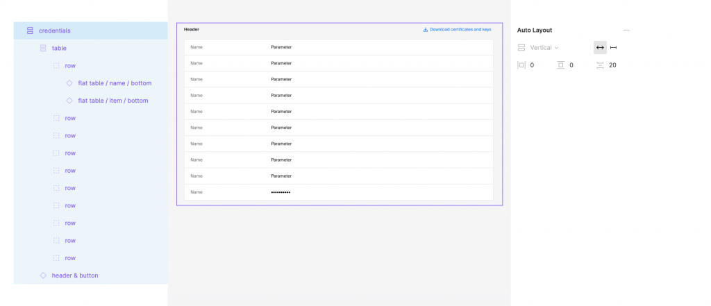
Then I use Auto Layout with 0 spacing to make the table.
Templates
The template has a content section where we collect all dynamic elements and a few components that sit in their places (breadcrumbs, section header).
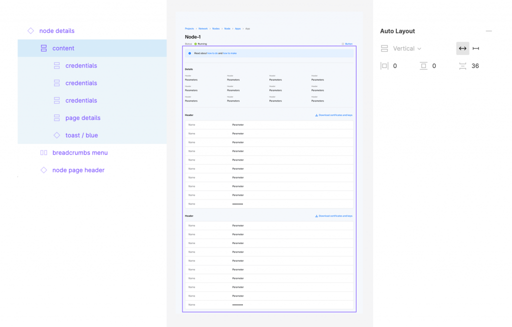

I didn’t add the main header to the final template because components in Figma don’t support fix position when scrolling for its elements. This is the only reason that doesn’t allow us to use this page as a component, but it’s not a problem for short pages that fit 100% of its content to the screen.
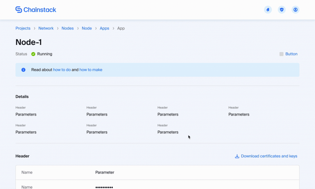
Now we have a very flexible, easy to support page. This is what it looks like in the end.
In the animation above, you can see how our atomic design page works in the prototyping mode in Figma.
That’s how simple and clean the page looks. On top of that, all components on the page are very flexible and responsive, and I can use them across all my design files. In case of any changes in the design of the page, I can update them in my library, and it will update all my design files automatically.
Here is a link to the page: https://figma.fun/TxDFA4
P.S.
Figma suggests using an automatic Auto Layout creation (press Shift + A) for simple components, and usually it works well, but sometimes it doesn’t work as expected. Instead of removing the background layer and replicating it with Auto Layout parameters, Figma thinks that it’s an object that’s supposed to be a part of the component that we’re trying to create. You can see an example of this behaviour below. In this case, I create the Auto Layout component manually.
Join our community of innovators
- To learn more about Chainstack, visit our Knowledge Center or join our Discord server and Telegram group.
- Sign up for a free Developer account, or explore the options offered by Growth or Business plans here.
- Take a look at our pricing tiers using a handy calculator to estimate usage and number of nodes.
Have you already explored what you can achieve with Chainstack? Get started for free today.


